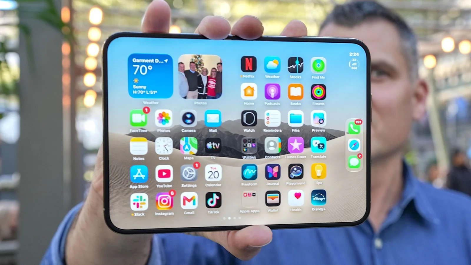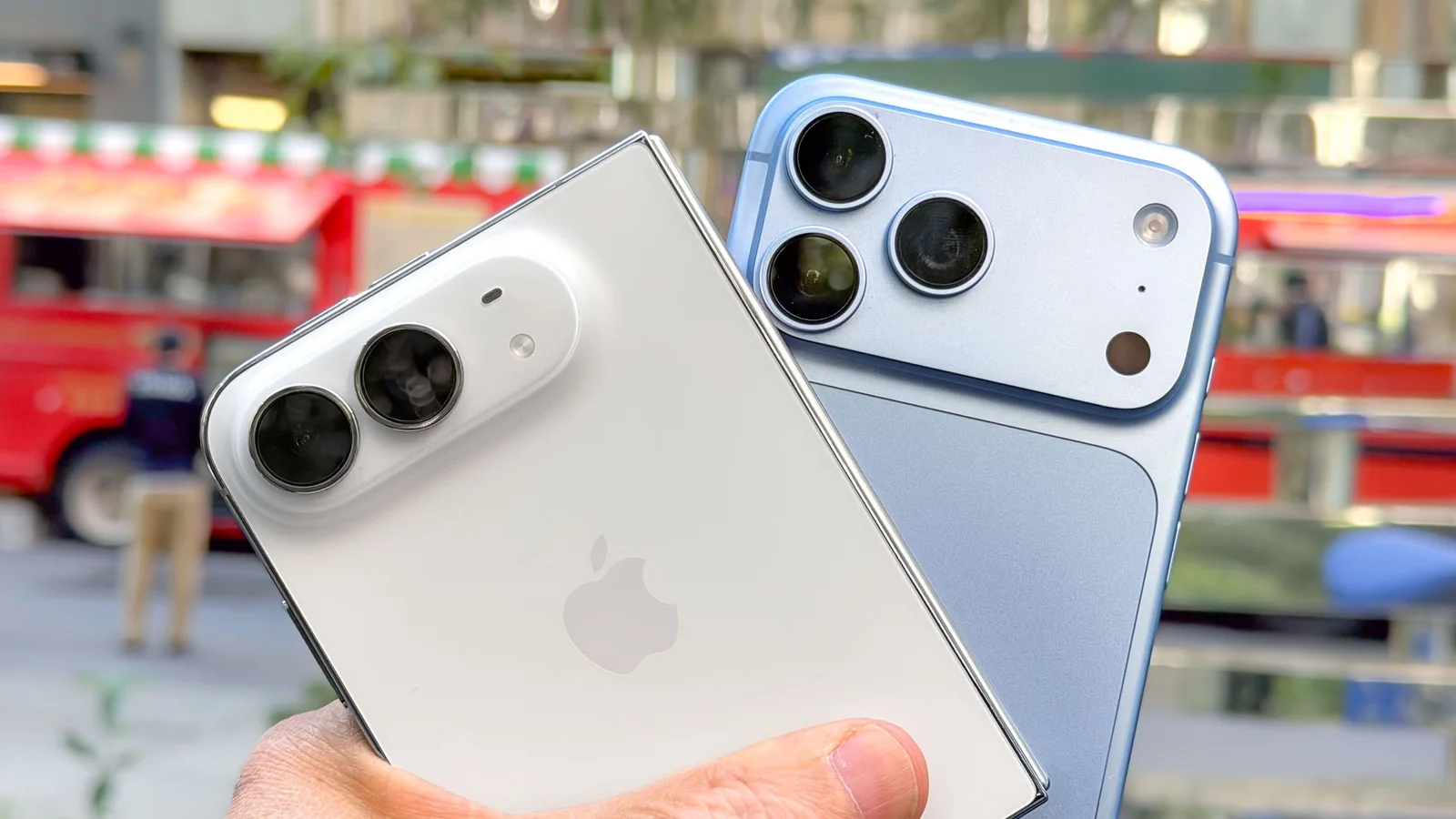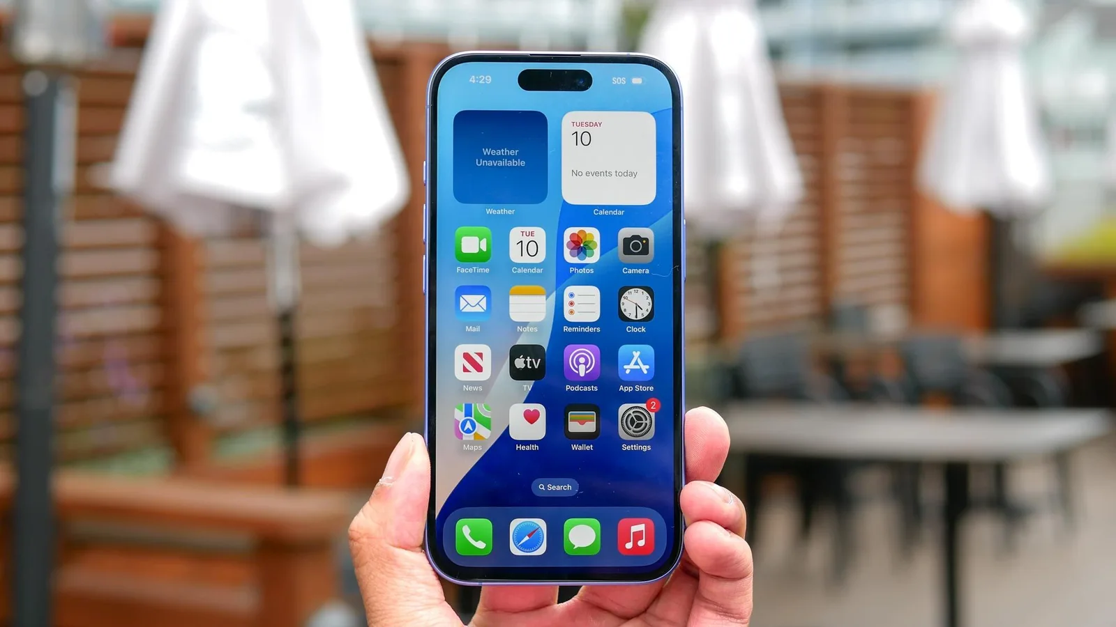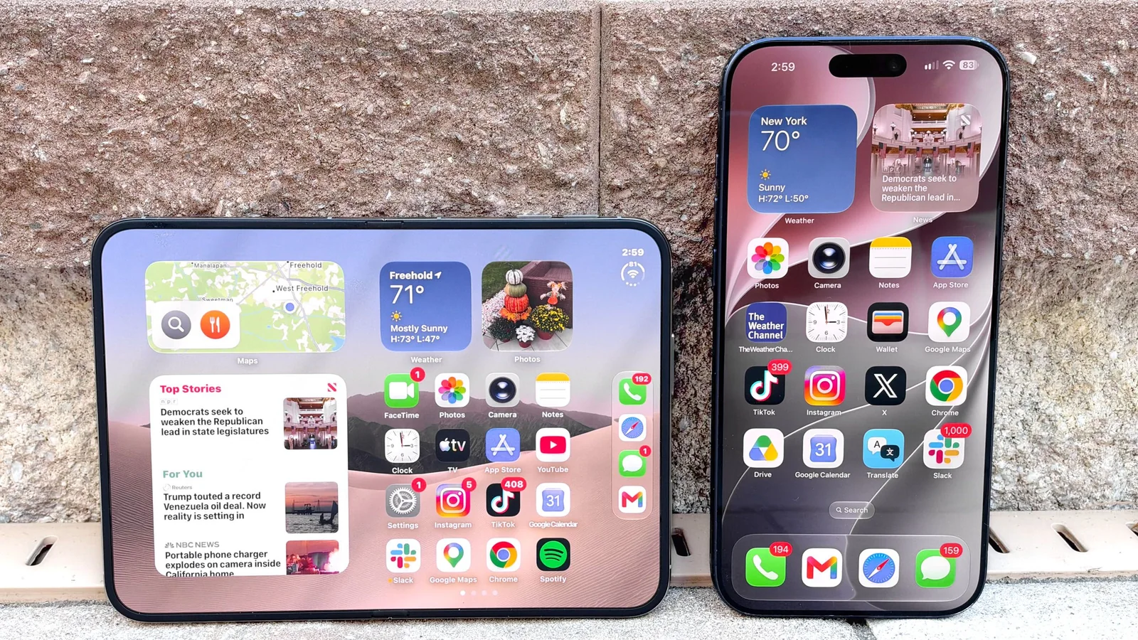
It’s one thing to test out a phone for a review, but it’s another to ditch your everyday phone for a foldable — especially one that still feels unfinished in some ways. Don’t get me wrong, the iPhone Duo at times feels magical, especially when I used it to binge watch Netflix on its massive screen during a flight and when regularly multitasking with two apps side by side (finally).
Initial Impressions
But during my two-week experiment of swapping out my iPhone 17 Pro Max for the iPhone Duo I did question whether I would upgrade to this device and spend $2,000 for it. Here’s what I really like about Apple’s first foldable so far, what needs work, and what it’s really like to live with it as your daily driver.
Versatile Design with Multiple Modes
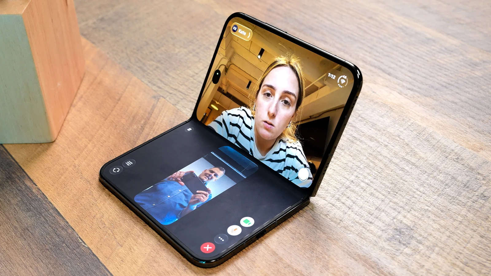
Apple has done an excellent job making the iPhone Duo as versatile as possible with its design. Unlike the Galaxy Z Fold 8, the hinge holds various angles well and the software adapts as you bend the device.
While on a recent business trip, I used the tent position to turn the Duo into my alarm clock in Standby mode. I also like to use the tabletop mode for FaceTime calls, as I usually like to pace around the room while I talk. This flexibility is a significant advantage.
Immersive 7.6-inch Display for Content
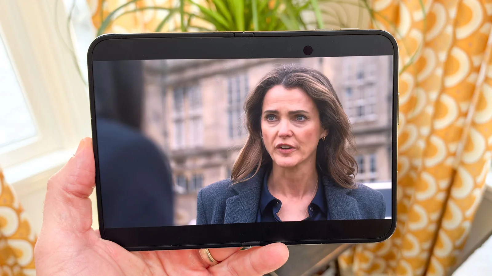
I recently traveled back from Los Angeles, and the in-flight internet was so slow I gave up on doing work.
Instead, I relaxed and caught up on ‘The Diplomat.’ It was fantastic having a 7.6-inch screen at my disposal to watch the intrigue unfold. I was completely engrossed in the action during a particularly perilous episode, with rich colors and abundant detail.
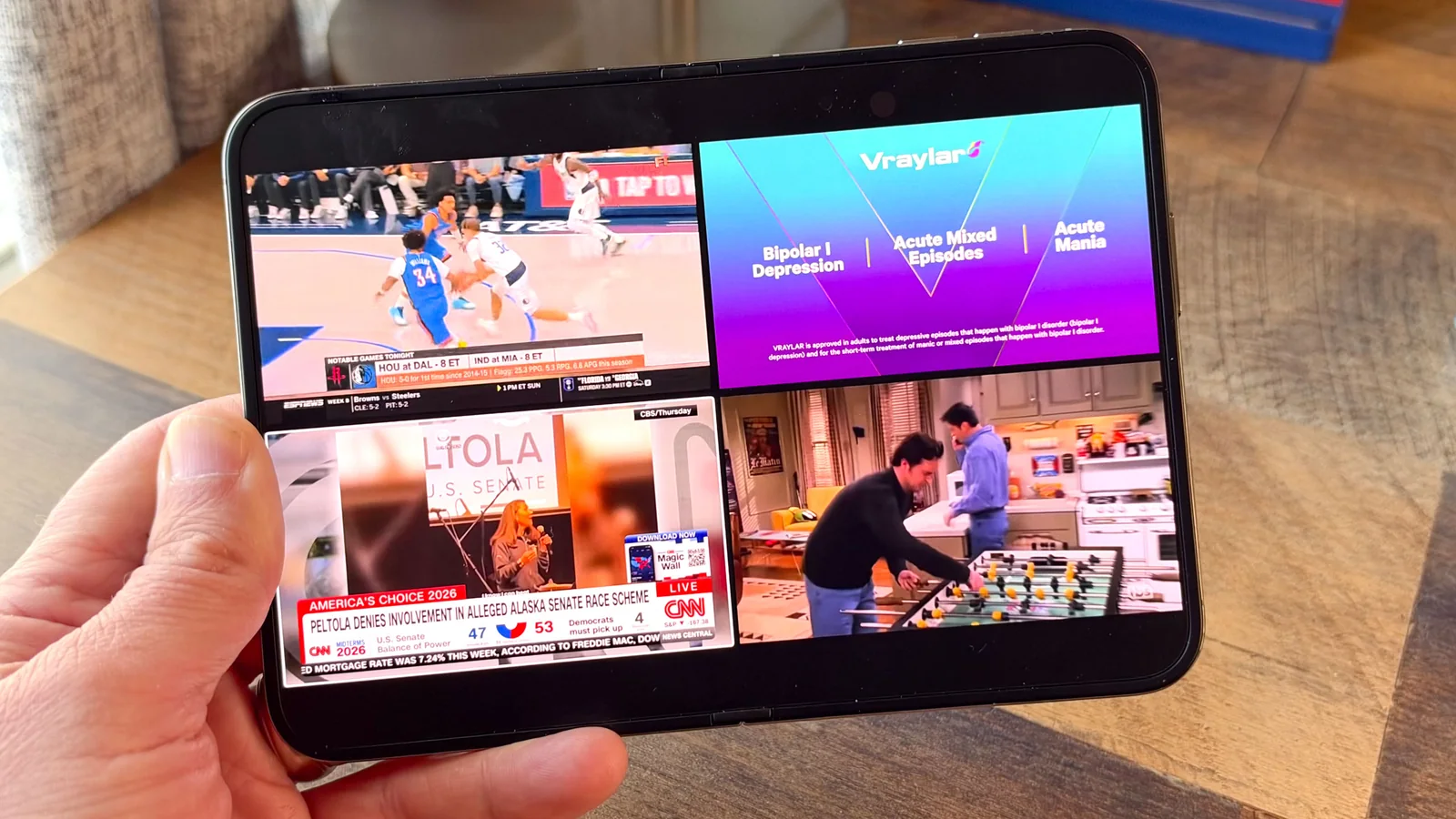
Another benefit is the YouTube TV app. I appreciate being able to watch four channels at once in a grid view, a feature also available on Android foldables.
Efficient Split View Multitasking
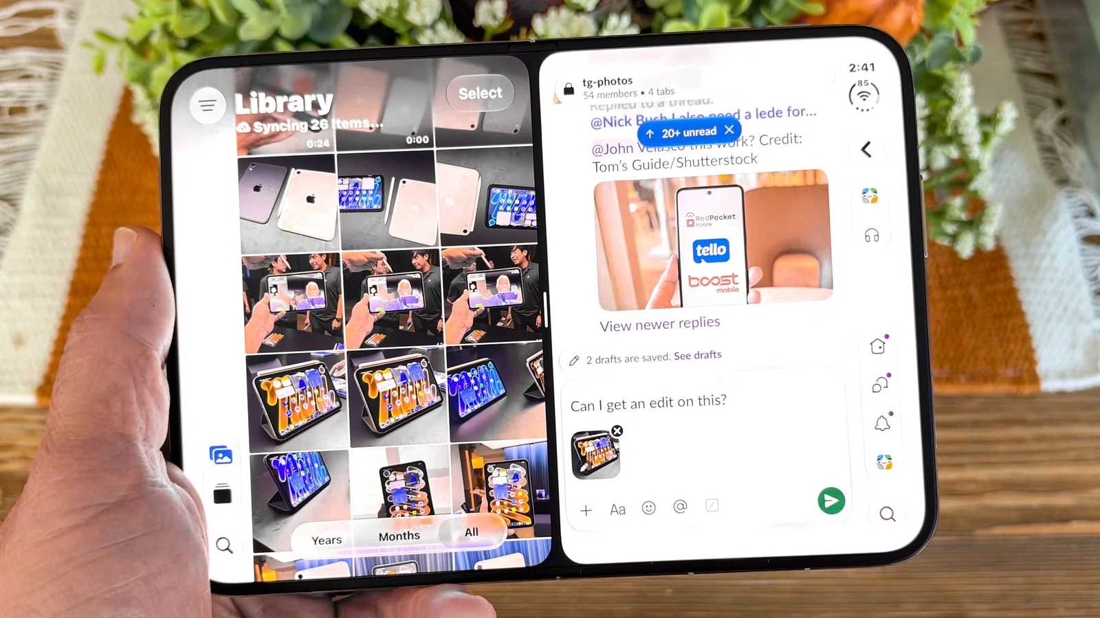
While long overdue, the ability to run apps side by side is highly appreciated. For instance, I frequently receive emails about upcoming meetings and appointments, and being able to open Gmail in one window next to Google Calendar in another significantly streamlines my day.
I also regularly upload images to our dedicated photo channel in Slack, and it’s convenient to drag and drop images directly from the Photos app into the chat. Additionally, you can tap the middle of this split view to save the app pair for quick access.
Enhanced Social Media Experience
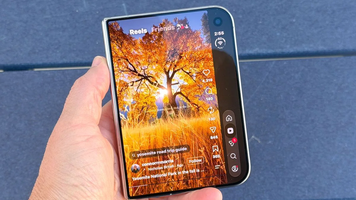
For those who enjoy social media, the iPhone Duo offers an incredibly immersive experience. Videos appear good on the cover screen, but on the large main screen, they are far more engaging in portrait mode. A particularly neat feature is the ability to see comments on the right in landscape mode, which remain visible as you scroll.
Capable Cameras (Without Telephoto Zoom)
I’ve been generally impressed with the iPhone Duo’s cameras, despite the absence of a dedicated telephoto lens. For example, the Duo captured a stunning shot of the Los Angeles skyline just after sunset, with deep blue, orange, yellow, and red tones all clearly visible.

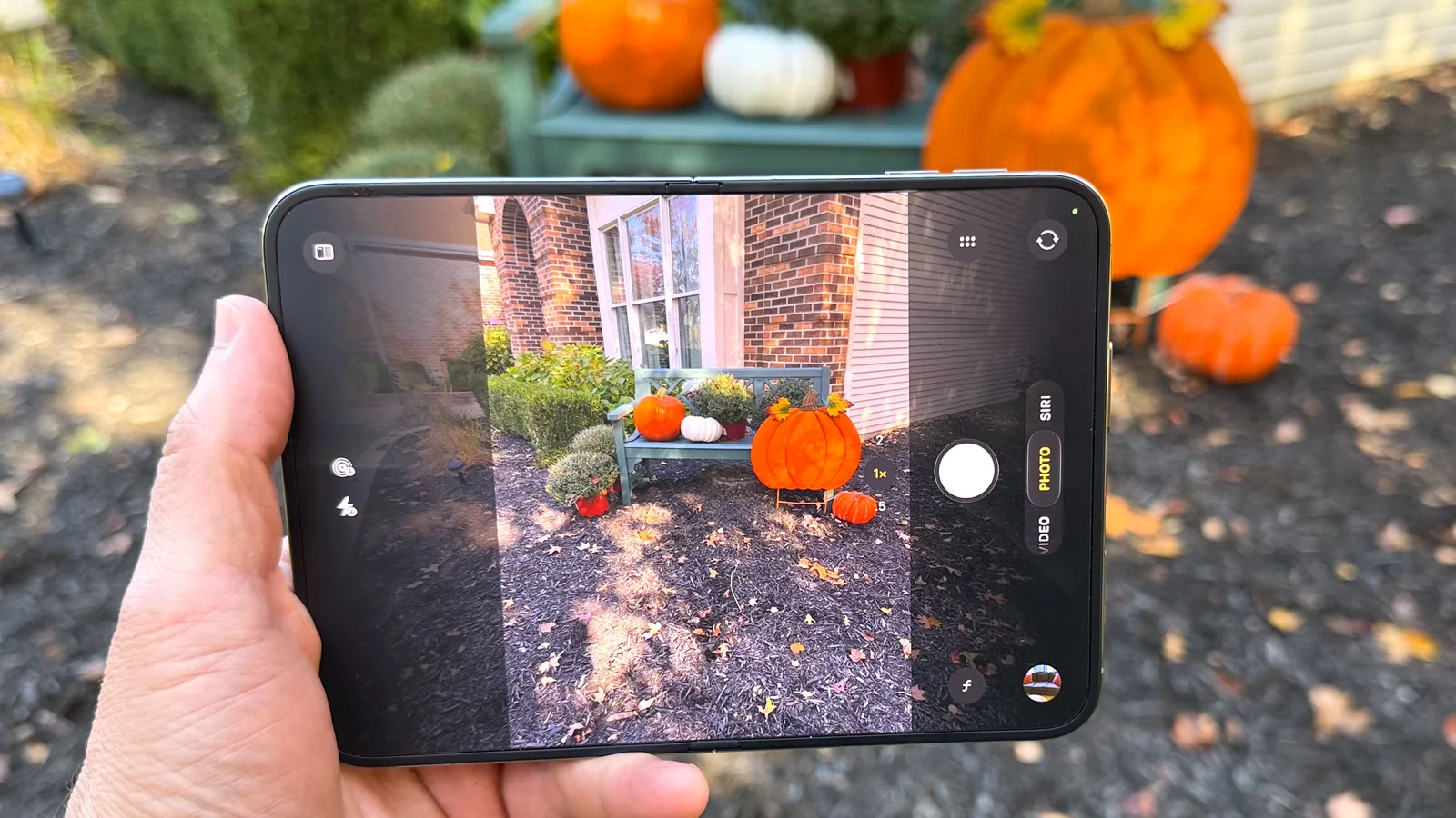
The iPhone Duo also performed well in capturing a shot of pumpkins in a large cornucopia, revealing a surprising amount of detail in the shadows.
Noticeable Weight in Pocket
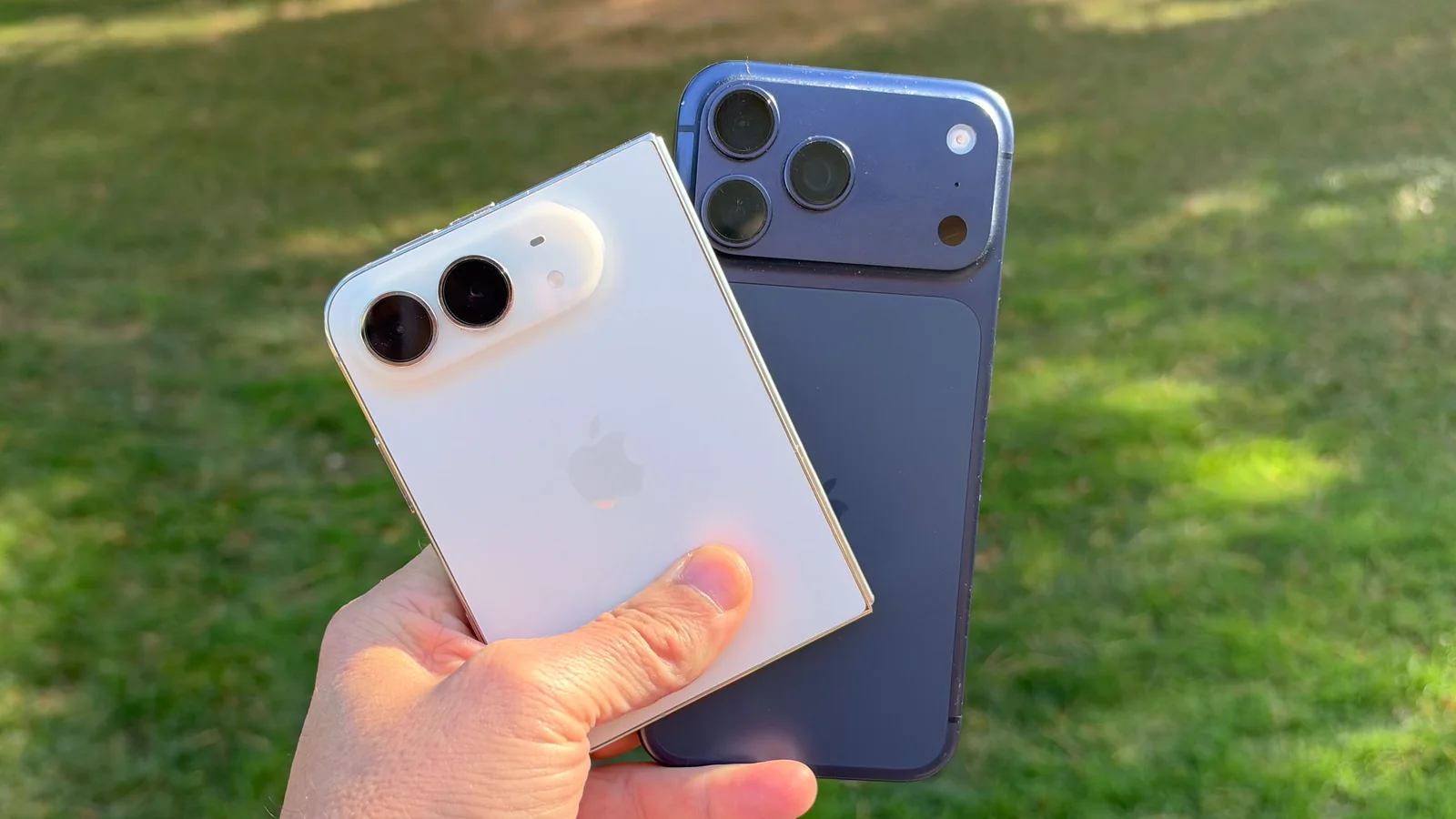
One of the supposed benefits of the iPhone Duo is its compact size when closed, allowing it to slip into a front pocket. While it fits, I noticed while walking around that it significantly weighed down that pocket.
The actual weight difference isn’t huge at 8.96 ounces (254 grams) for the iPhone Duo versus 8.22 ounces (233 grams) for the iPhone 17 Pro Max, but it’s enough to be noticeable and somewhat inconvenient. I had to tighten my belt an extra notch to prevent my pants from sagging, and often ended up putting the Duo in my back pocket instead.
Multitasking View Breaks on Rotation
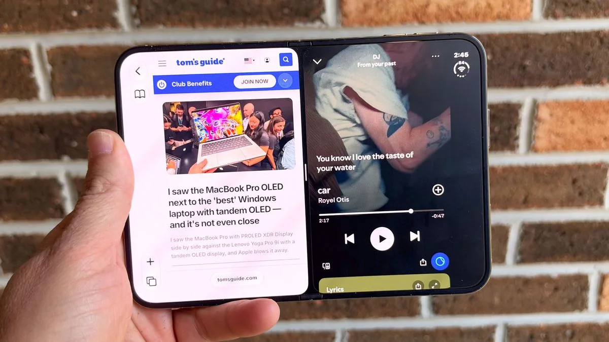
Apple deserves credit for making Split View multitasking on the iPhone Duo intuitive. You simply swipe up on an app and place it on the left or right side, then add another app.
However, the moment you rotate the phone from landscape to portrait view, the app pair disappears. This behavior differs from Samsung’s Fold 8 and Fold 8 Ultra, where the multitasking view persists. The only multitasking available in portrait mode is placing a video window on top of another open app.
Awkward Photo-Taking Experience
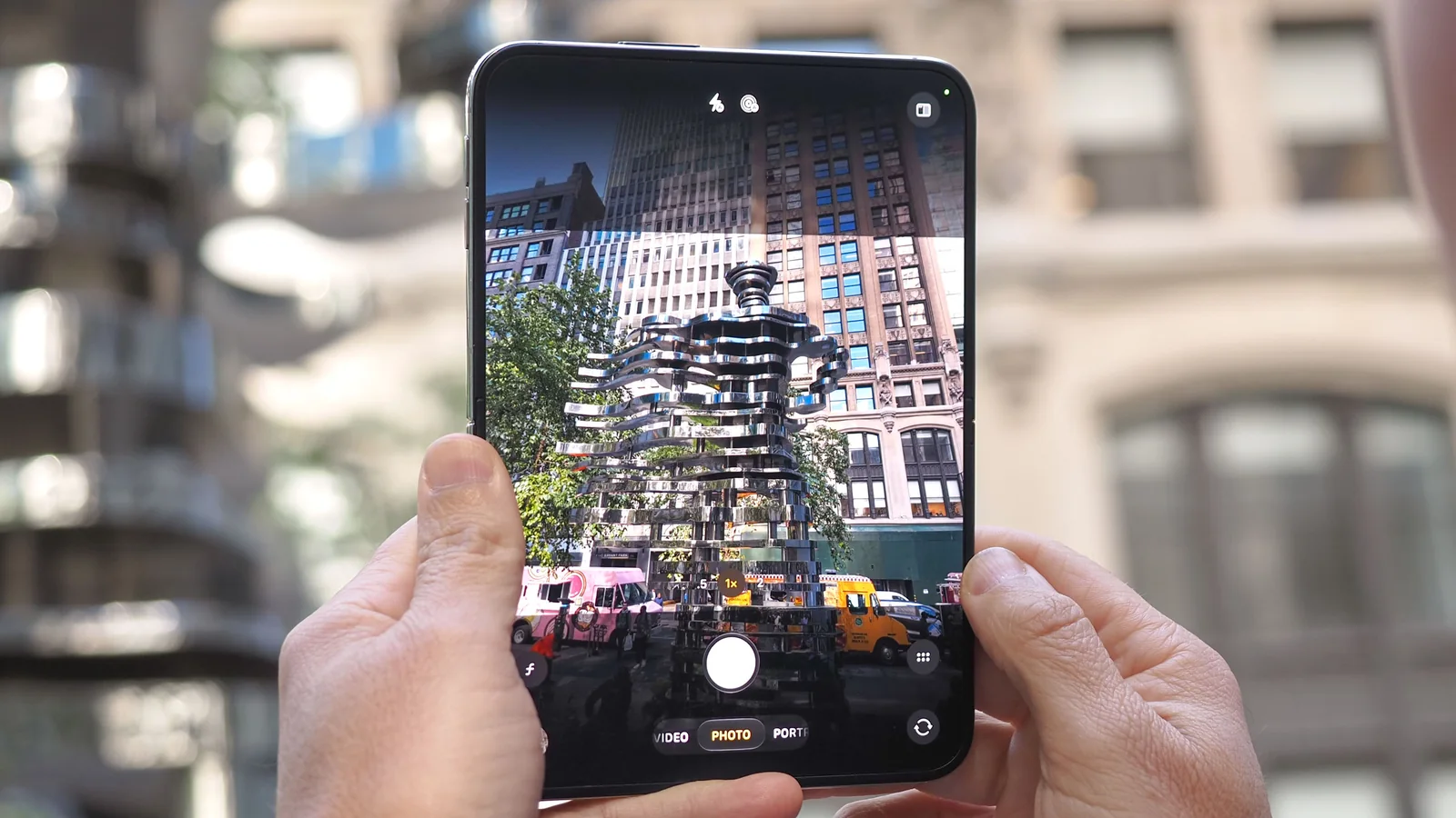
While I enjoyed reviewing and showcasing photos on the iPhone Duo’s large display, the act of taking photos feels awkward. This isn't solely due to the large display; I would actually appreciate a larger viewfinder at times.
The issue is that the Duo captures portrait photos in landscape mode and landscape photos in portrait mode, which is counterintuitive. While one can adapt, it is disorienting initially.
Poorly Placed Volume Buttons
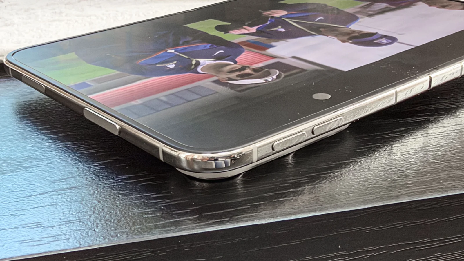
If I were designing the iPhone Duo 2, my first change would be to relocate the volume buttons. They are positioned on the top of the phone, which I find awkward to use. It’s manageable when the phone is closed, but it requires a stretch with the main display open. Personally, I would prefer to lose the Camera Control button or place that at the top instead.
Lack of App Optimization
While many developers have been updating their apps for the iPhone Duo at a fairly rapid pace, it is perplexing that so many apps remain unoptimized.
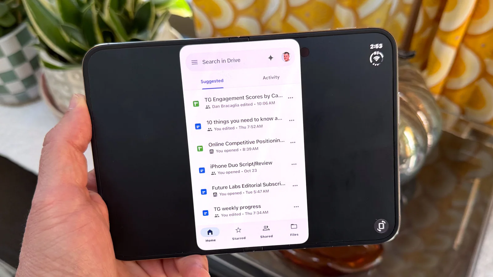
For example, Google Calendar performs poorly on the iPhone Duo, displaying large black bars on both the left and right sides. The same issue applies to Google Drive. Interestingly, Google has optimized other apps, such as YouTube and YouTube TV, which utilize the entire screen.
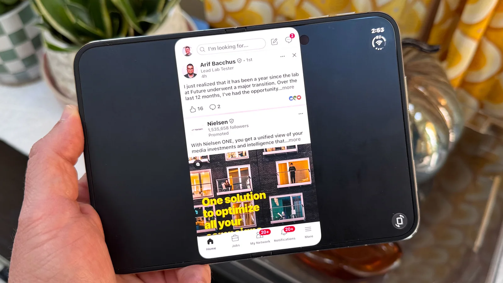
Even Gmail offers a subpar experience on the Duo. It fills the display but lacks a two-column layout found on the Galaxy Z Fold 8. LinkedIn is another example; one would expect its app to be updated by now.
Inefficient Right-Hand Menus
It's understandable why Apple chose to move the dock and app controls to the right side. With such a wide front display, reaching across to the bottom left, for instance, would be challenging. However, this UI change is not entirely successful.
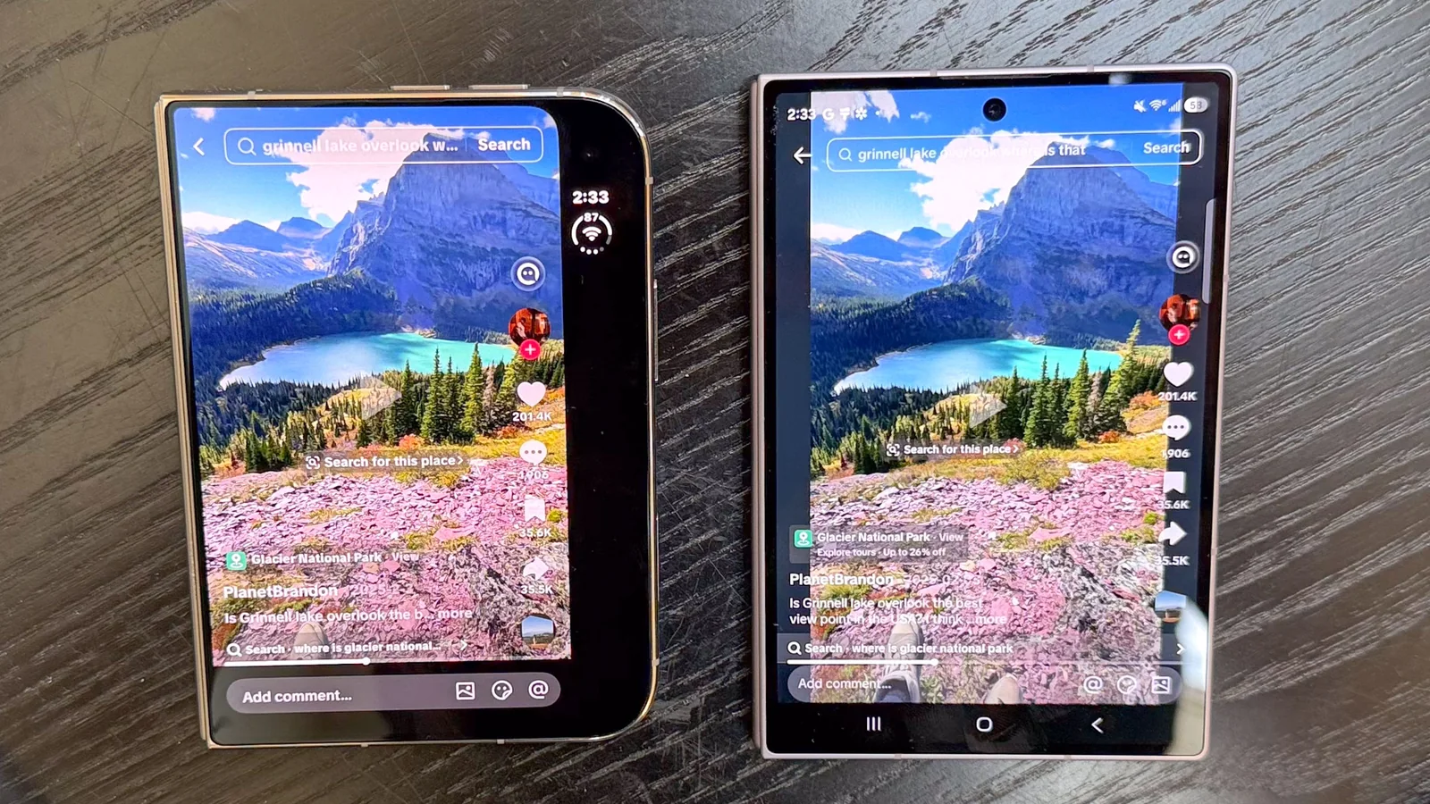
When you have only 5.4 inches of usable space, dedicating so much room to right-hand menus in every app seems inefficient. Consider Instagram, which is fully optimized on the iPhone Duo; the right-hand strip reduces the available space for watching videos compared to the Fold 8.
The situation is even worse with apps that feature a black bar on the right side, such as TikTok. Furthermore, some apps have right-hand menus that obscure content as you scroll. Perhaps Apple should move all controls to the bottom and allow developers to hide them, revealing them with a swipe or tap?
Final Verdict
After two weeks of using the iPhone Duo instead of my iPhone 17 Pro Max, I believe Apple has delivered a foldable phone that is largely well-designed. I appreciate having a large display on the go that folds into a more compact form factor. It’s akin to having an iPad Mini in your pocket, even if it adds a little weight.
I also value the quality cameras, split-view multitasking, and the experience of consuming vertical video. However, I am quite surprised that many high-profile developers have not yet fully updated their apps, which can make the Duo feel unfinished. Additionally, I disagree with some of Apple’s own design and UI decisions.
Should you wait for an iPhone Duo 2? Not necessarily. I find the iPhone Duo compelling, but I might advise waiting for Apple and its partners to resolve some of the initial issues before investing two thousand dollars.